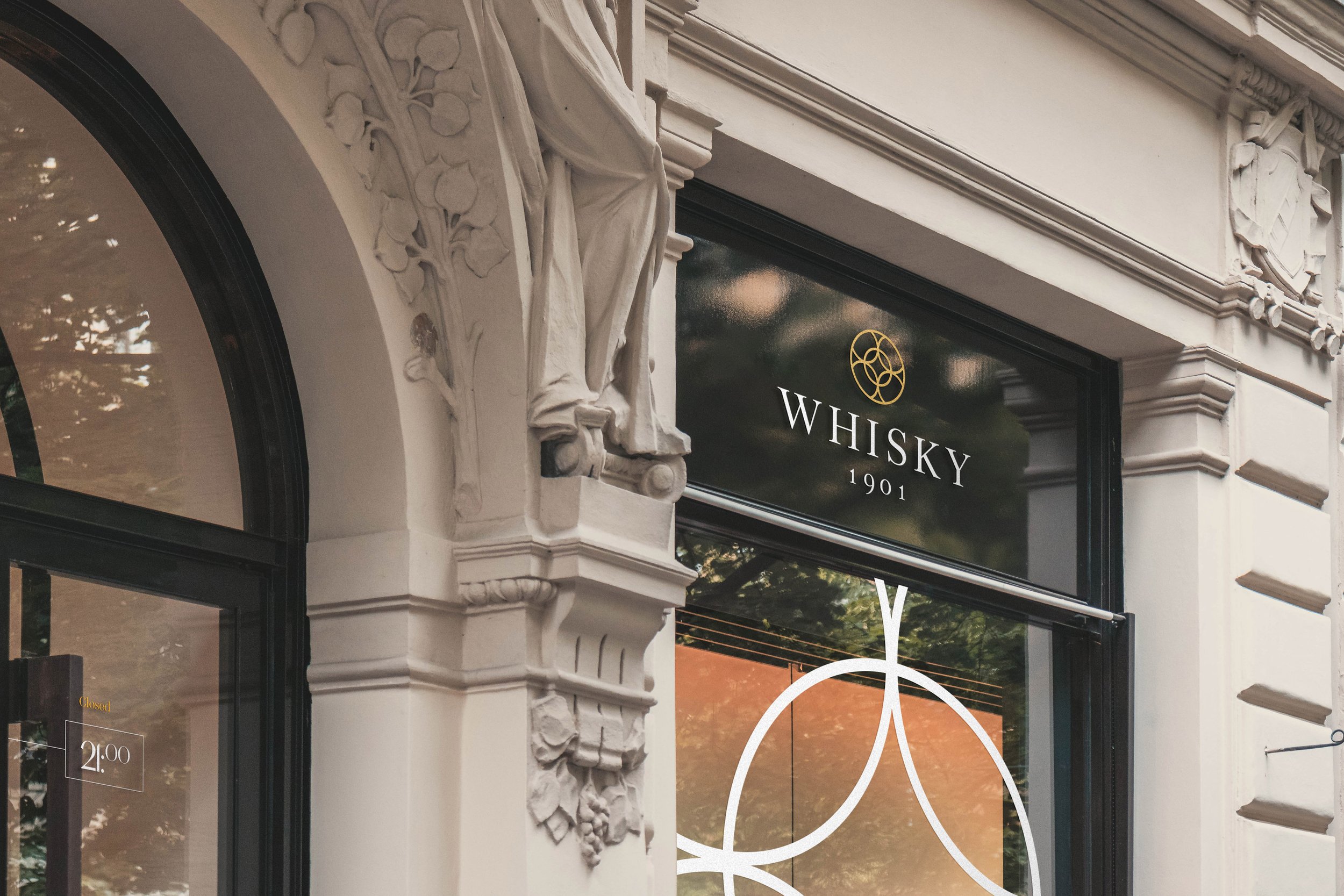
A safe haven for Whisky investment
Whisky 1901, a London-based investment company, approached us to refresh their branding to better reflect their mission.
© Berkeley Communications
My role on the project
As the lead designer, I guided the rebranding process, crafting a marque inspired by the six hoops of a whisky barrel, symbolizing tradition and craftsmanship. To complement this, I paired it with a classic serif typeface, reflecting the company's heritage and industry expertise. I also developed a comprehensive brand book outlining imagery, typography, logo usage, and the tone of voice defined by our content team. Additionally, we provided a suite of assets, including letterheads, contract designs, and a corporate investment guide, ensuring a cohesive and professional brand presence.


